Creating an interface
Interfaces is what makes the HUD, Netricsa, etc. This means an interface can either be shown passively (without user input) or actively (with user input).
Note
This page is a work-in-progress!
The gui file
Let's start by creating a gui file. Let's call it hello.gui and we'll put it inside of our scenario in a gui folder. We will discuss its contents later.
<gui>
	<doc>
		<group>
			<text anchor="0.5 0.5" font="gui/fonts/font_agency16.fnt" text="Hello, world!" />
		</group>
	</doc>
</gui>
Drawing our interface
To draw our interface, we need to add it to a place that draws stuff. A prime example of this is the RenderWidgets function of a gamemode. But first, we need to instantiate a Widget Hoster which will do most of the hard work of interfaces for us. Here's how we would load the hello.gui file inside of a gamemode:
	IWidgetHoster@ m_interface;

	BasicVersus(Scene@ scene)
	{
		super(scene);

		// Create a widget hoster
		@m_interface = IWidgetHoster();

		// Load hello.gui into it
		m_interface.LoadWidget(m_guiBuilder, "gui/hello.gui");
	}
In our gamemode constructor, we instantiate a basic IWidgetHoster, put it in m_interface and tell it to load our gui file.
Now, to actually draw our interface to the screen, we override the RenderWidgets function:
	void RenderWidgets(PlayerRecord@ player, int idt, SpriteBatch& sb) override
	{
		// Draw our interface
		m_interface.Draw(sb, idt);

		// Remember to call the base function from the inherited gamemode!
		VersusGameMode::RenderWidgets(player, idt, sb);
	}
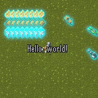
The result should look like this:
More about the gui file
Gui files are formatted as basic XML. Here, the gui tag is our root element, and is required for all interfaces. Inside of this, we have the doc tag, which is also required. Inside of that, we have our first widget, which will be the root widget. In this case, we use the GroupWidget by using the group tag. A group widget does not draw anything to the screen. Instead, it is simply a container. It has the special property that it will automatically take the width and height of its parent widget, or if there is no parent widget, the entire screen. This makes it perfect as a container for all other widgets.
Inside of that, we have our first real widget, a TextWidget, which we indicate by using the text tag. This widget is inside of the group tag, which means that this text widget is a child of the group widget, and the group widget is its parent. Also note that we close the text tag immediately instead of opening it, since we don't need to have any child widgets inside of it.
The font and text attributes speak for themselves, however the anchor attribute in the above example is more interesting. This is a vector attribute, meaning it accepts 2 floating point numbers. The first is X, the second is Y. These values defines the scalar position of the widget within its parent's size (based on its own size). For example, if you set the anchor X to 0, the widget will be left-aligned. (0 is the default for both X and Y if you don't define the anchor.) If you se this value to 0.5, it will be aligned in the center of its parent. And if you set it to 1, it will be aligned on the right side. The same counts for Y, but then for the Y axis, where 0 would be the top and 1 would be the bottom. Thus, in our example above, 0.5 0.5 means to put the widget exactly in the center.
